POW
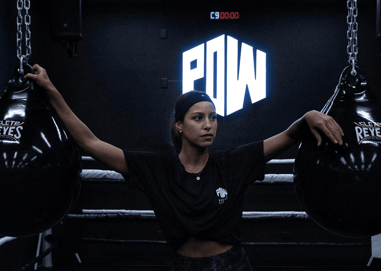
POW was created as a short, direct, and energetic identity for a boutique boxing studio. The name comes from the sound and impact of a punch. It works as both a verbal expression and a visual mark, making the brand easy to remember and immediately connected to movement, force, and rhythm. The identity is built around a compact geometric wordmark that reflects the physical energy of boxing. In its secondary lockup, the structure suggests a fist and forearm, reinforcing the idea of power in motion. The final system gives the studio a strong and minimal visual presence, designed for signage, digital content, apparel, and the full fitness experience. Ig: @powboxingstudio | www.powboxingstudio.com
Client
Pow Boxing Studio
DELIVERABLES
Concept Development Naming Branding Brand Strategy Brand Guidelines Booking Website
Year
2023
Role
Brand Strategy & Creative Direction